
Master Wings Publishing was founded in 2012 by Col. Jennifer Pritzker as an extension of her desire to protect and connect communities through history, which can be seen in her other business and philanthropic endeavors. Over the years, we have proudly published numerous titles from authors who have inspiring stories to share about overcoming obstacles. Aside from our books, we also take pride in the name of our brand, Master Wings Publishing.
The name “Master Wings” is related to the jumpmaster or highest grade Parachutist Military Badge. The Parachutist Badge, also commonly referred to as "Jump Wings," is a military badge of the United States Armed Forces. Army Parachutist badges are awarded to Airborne personnel based on various criteria including training, service, and the number of jumps. The Master Parachutist honor is only awarded to those rated excellent in character and efficiency who have completed 65 jumps. Of these jumps, there are specific criteria that must be met including the types of jumps, the situation of the jumps, and the duration of service.
To earn this badge means you are not only qualified, but you are also in charge of the jump. Col. Pritzker noted that to have your Master Wings, your “equipment is on point, your coordination is on point, and you’re prepared when you go out the door.” Her vision for Master Wings Publishing was an organization that exemplified those requirements - the team from authors to accountants would be qualified, communicative, and valued. Master Wings would have its Master Wings.
Above all, Master Wings strives to do business with excellence. We publish exceptional books that inspire, educate, and last. We focus on empowerment not only to illustrate the importance of lessons like resilience but also to entertain and add to the historical record.
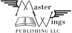
Master Wings Publishing has had two logos since opening.
The logo below was used until 2018. As you can see, it displayed the wings that gave the name character, and included an illustration of a book to make the connection to publishing.
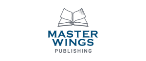
As part of a broader branding strategy, to better match Master Wings with other entities in the Tawani Enterprises, Inc. portfolio, the logo was changed in 2018. For a cleaner and coordinated look, the wings and book were combined, and a non-Serif font and splash of color was added. The pages of the book are now the wings, and the image is more dynamic.
One of the last drafts looked like this:
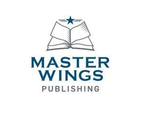
This wasn’t, however, the final draft. With Col. Pritzker’s particular guidance, the military influence on the entity was further emphasized by adding a star – a traditional U.S. military emblem dating back to the American Revolution.
The final, updated Master Wings logo therefore became:
Did you notice the wing reference in the book? Do you have additional questions about the lore of Master Wings? Let us know on our social media. We’re on Facebook and Instagram.